The website is where the brand goes to work. It combines message, motion, layout, and interaction into something that feels clear, fast, and convincingly built.
Buttons
Buttons are designed to move people forward without adding friction. From directional CTAs to form controls, each component is straightforward, recognizable, and tuned for action.
Arrow CTA — Regular
20px · Aspekta 400 ·
-0.2px tracking · gap 8px · padding-bottom 8px
Arrow CTA — Large
40px · Aspekta 400 · -0.4px tracking · height 48px
Large Form Pill
Contact form · category select · 64px · border-radius 80px · hover fills white
Form Pill
Contact form · budget select · 48px · border-radius 56px · click to select
Filter Pill
Work / Insights pages · content filter with count · 40px · click to select
Radio Button
Contact form · square toggle · 24×24px · white border · white fill on select
Play Button
Video player · 56×56px · white bg · black icon
Inputs
All inputs: #121212 bg · transparent fill · bottom border only · Aspekta 400 · no outline on focus
Email Input
Footer newsletter · 20px · border-bottom 1px solid rgba(255,255,255,0.1) · padding-bottom 16px
Dropdown (Form Field)
Contact form · Default → Expanded → Filled · click to interact
Navigation
All inputs: #121212 bg · transparent fill · bottom border only · Aspekta 400 · no outline on focus

Desktop — Default (transparent, on light hero)
Links vertical right column · 16px · color #121212 · normal tracking · padding-bottom 3.2px

Mobile — Default
Logo + 'Menu' text · 18px

Mobile — Menu Open
Full-screen · 40px links · weight 350
Footer
#121212 background · padding 0 32px · full-width

Visual Brand Assets
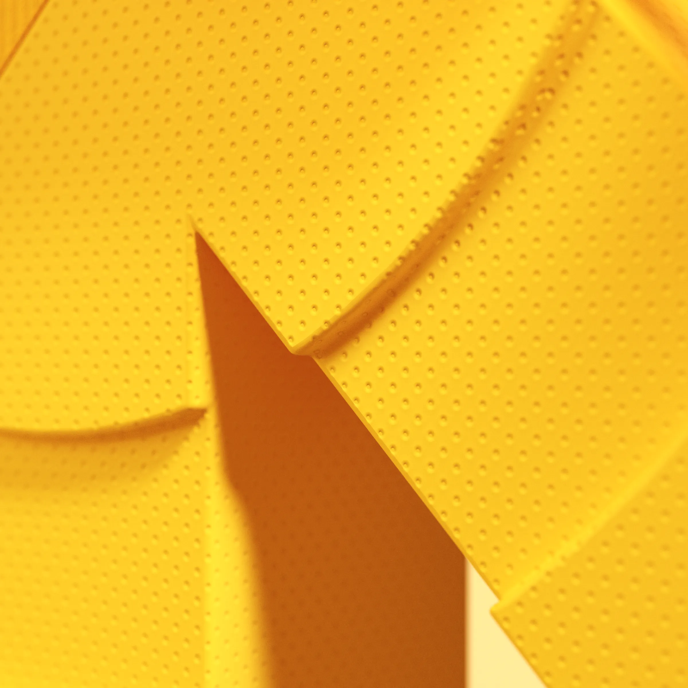
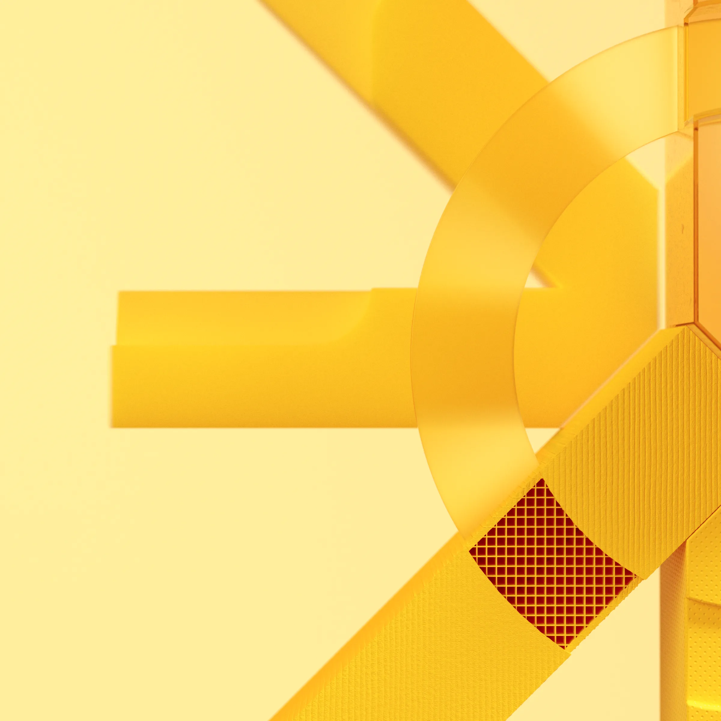
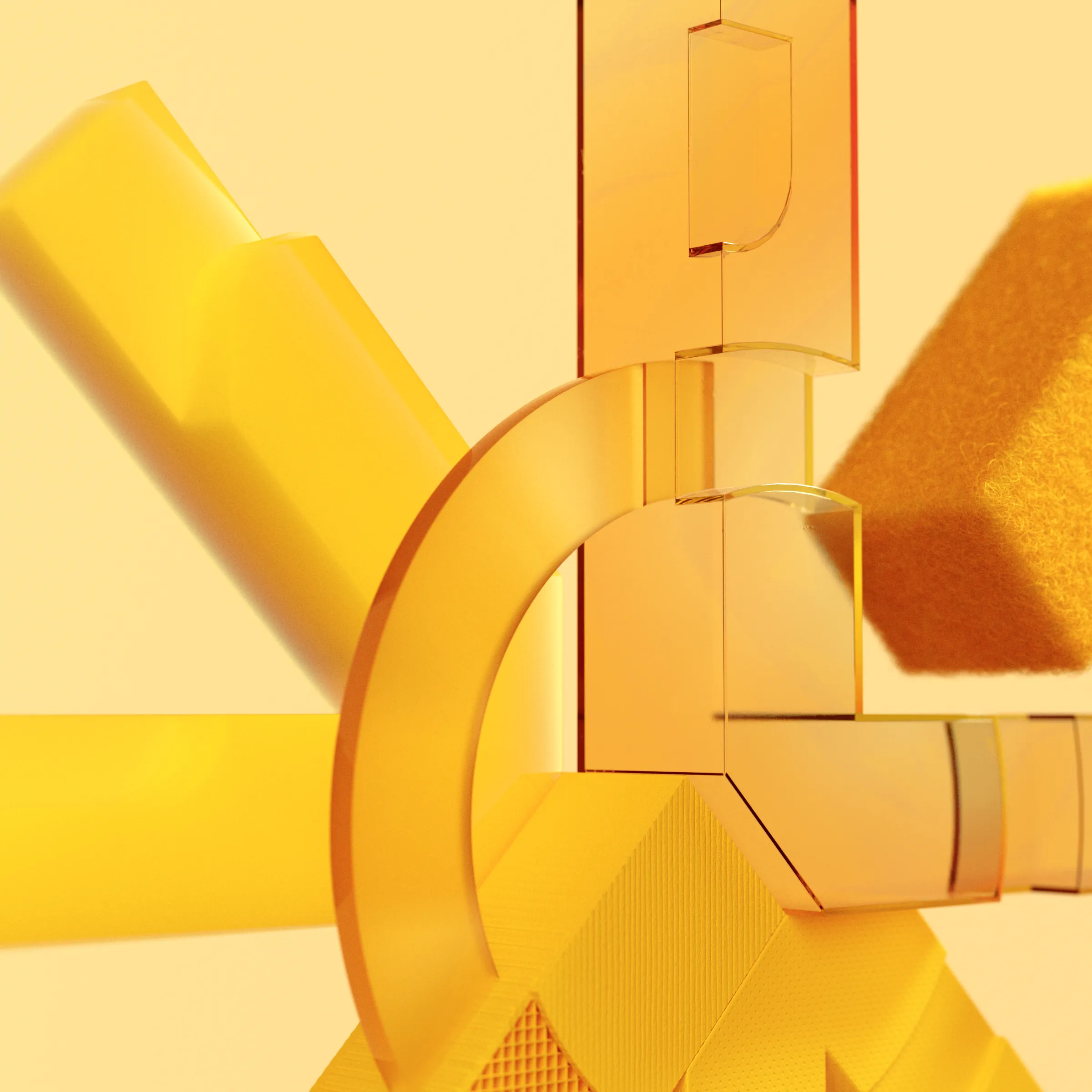
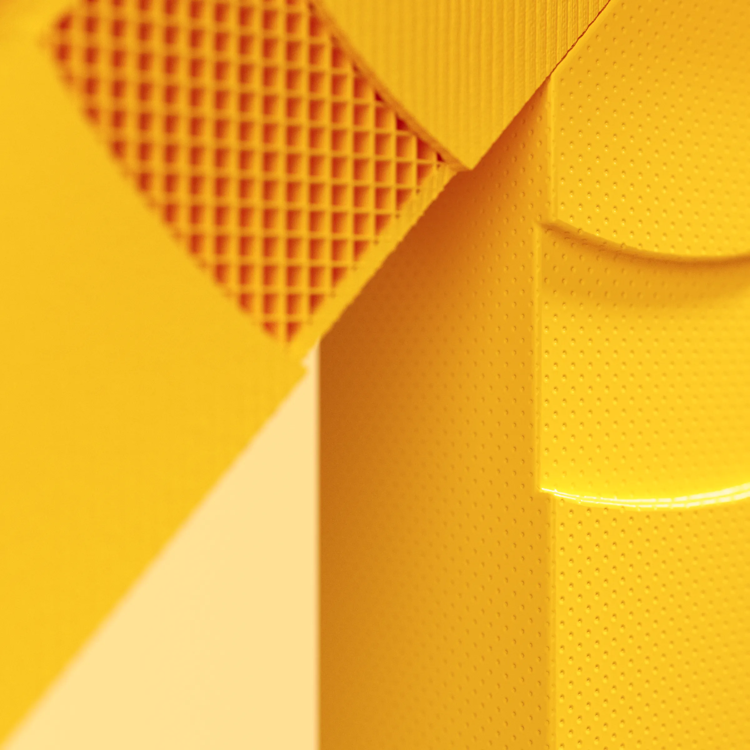
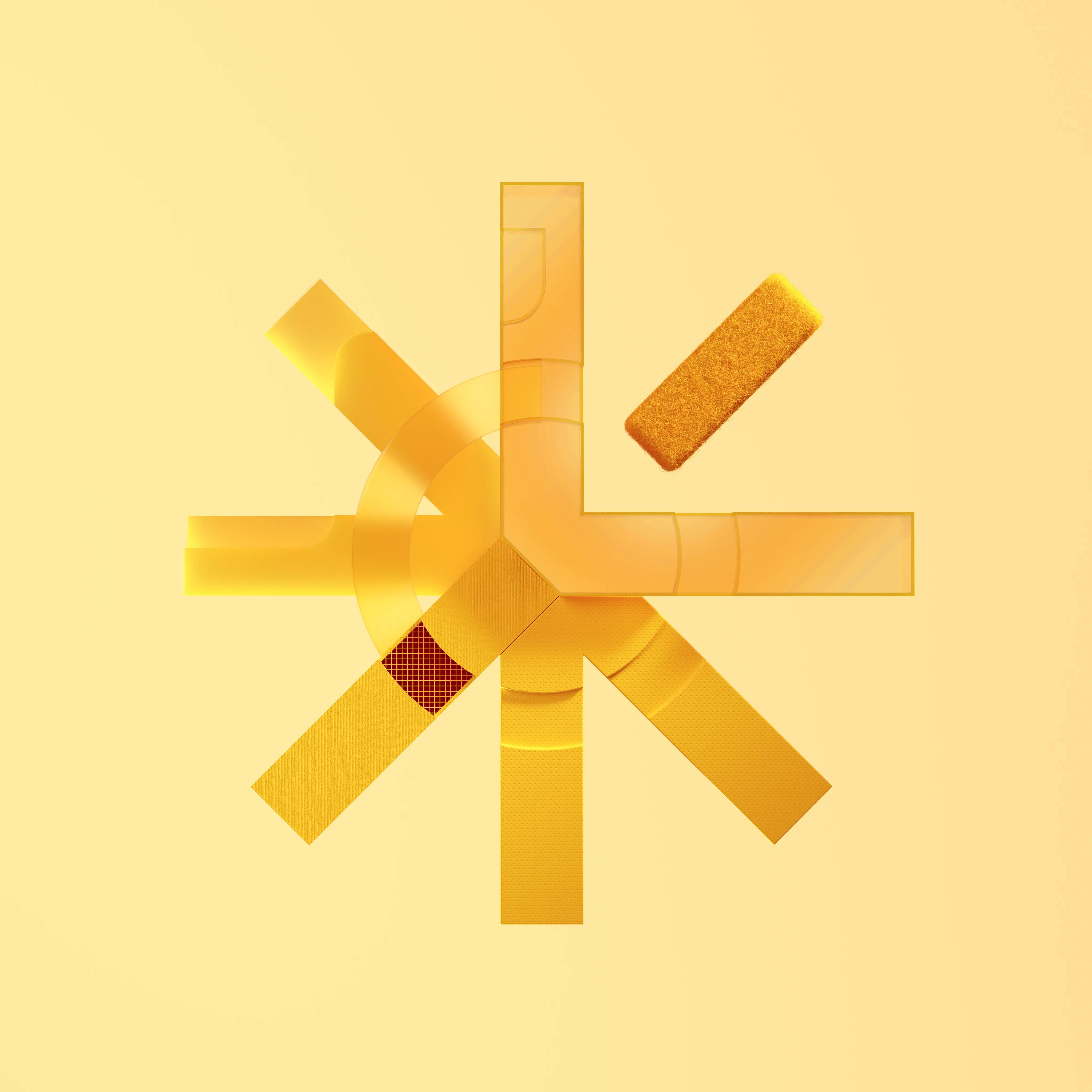
3D renders of the Zypsy logo with various materials. Available in JPG and PNG. Files live at zypsy/brand/imagery/Zypsy Logo Renders/

Video
Animated logo render for intros, transitions, and motion contexts. Files live at zypsy/brand/video/
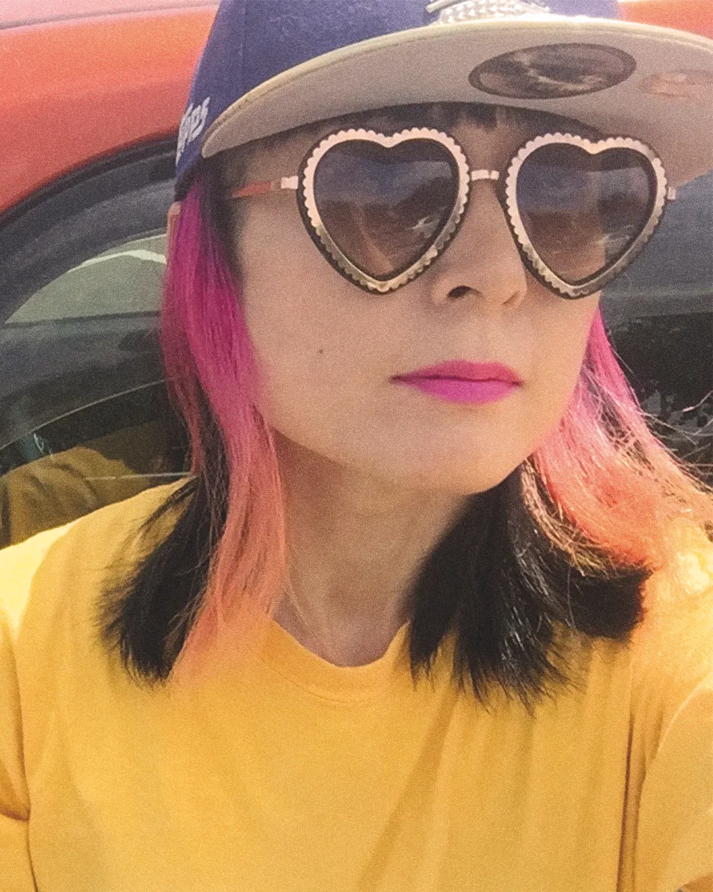
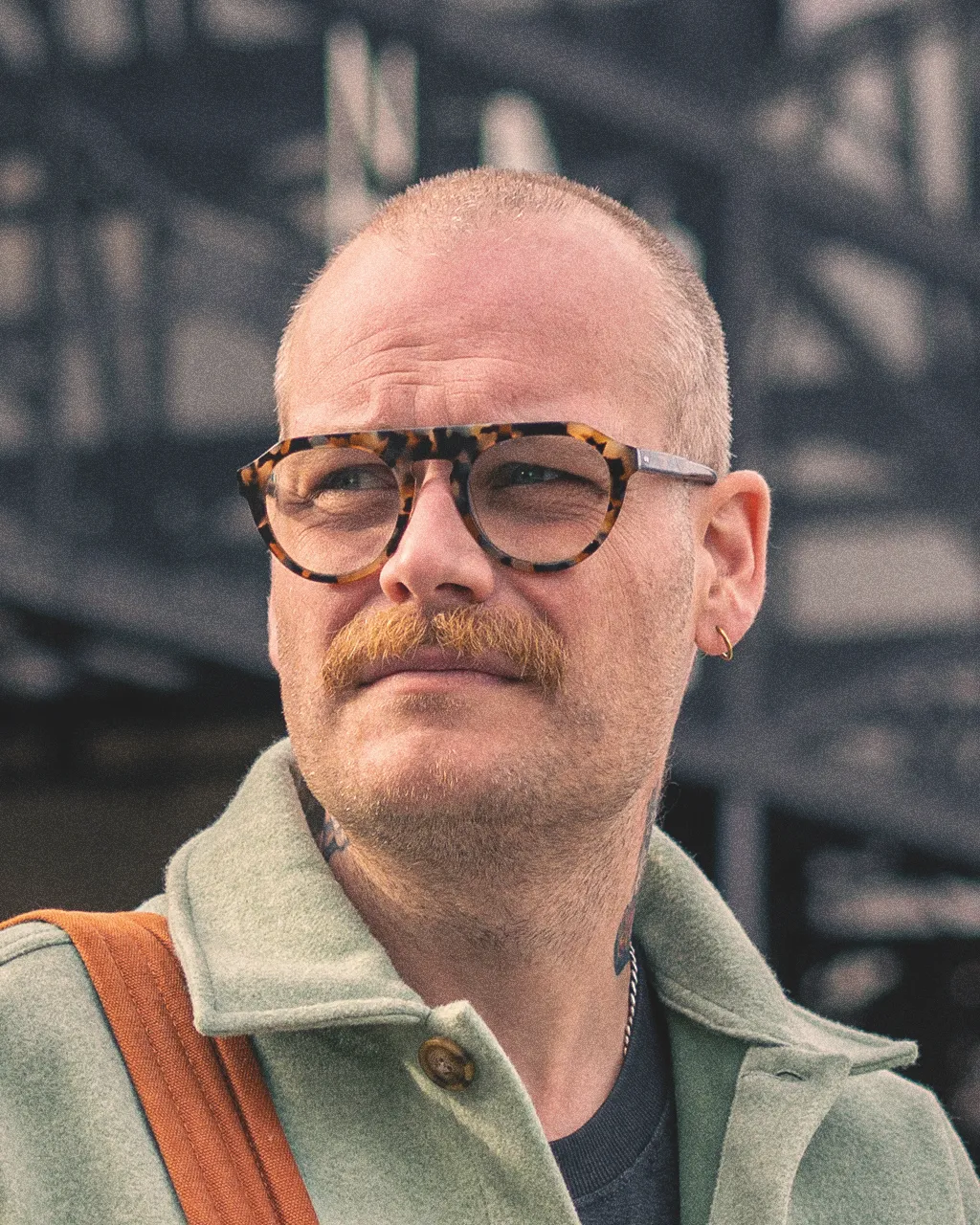
Team Photos
Portrait photos for all team members. Used on the About/Team page and in media kits. Files live at zypsy/brand/team-photos/ · PNG format.

Arek
Engineering Lead

Evin
Co-founder & CCO

Hubert
Senior Frontend Engineer
Shoko
Senior Project Manager

Kaz
Founder

Matt Kim
CEO
Olivier
Design Director

Matt Crisp
Senior Visual Designer

Pietro
Visual Designer

Marcin
Senior Product Designer

Rafal
Product Design Lead

Darek
Product Design Director

Vivian
COO

Trisha
Brand & New Business Director

Augusto
Lead Webflow Developer
Grid
We use a 12-column grid at 1440px with 32px margins and 16px gutters to maintain consistent alignment and clear visual structure across all layouts.
